|
Amethyst |
#4c2d56 |
#4c2d56 |
|
|
Aqua |
#93c8ce |
#93c8ce |
|
|
Aran |
#e1dcc9 |
#e1dcc9 |
|
|
Arbor Rose |
#cb4752 |
#cb4752 |
|
|
Black |
#000000 |
#000000 |
|
|
Bright Sky Blue |
#23abd1 |
#23abd1 |
|
|
Burgundy |
#4f0409 |
#4f0409 |
|
|
Butterscotch |
#f5d1af |
#f5d1af |
|
|
Cherry |
#ca0427 |
#ca0427 |
|
|
Chocolate |
#382a1f |
#382a1f |
|
|
Claret |
#790b24 |
#790b24 |
|
|
Clear Blue |
#6ca9d8 |
#6ca9d8 |
|
|
Deep Forest |
#47472f |
#47472f |
|
|
Fern |
#b8b878 |
#b8b878 |
|
|
Forest |
#9f9e68 |
#9f9e68 |
|
|
Gold |
#E5AF2B |
#E5AF2B |
|
|
Grape Punch |
#2a1562 |
#2a1562 |
|
|
Heather |
#e5d5be |
#e5d5be |
|
|
Kelly Green |
#288159 |
#288159 |
|
|
Lavender |
#a394bd |
#a394bd |
|
|
Lippy |
#ec6397 |
#ec6397 |
|
|
Navy Blue |
#1d1934 |
#1d1934 |
|
|
Orange Crush |
#d34f0e |
#d34f0e |
|
|
Pumpkin |
#d55c2f |
#d55c2f |
|
|
Red Hot |
#cd1d28 |
#cd1d28 |
|
|
Rich Orchid |
#8e177d |
#8e177d |
|
|
Rogue |
#c0484a |
#c0484a |
|
|
Royal |
#376bce |
#376bce |
|
|
Soft Fern |
#d0c784 |
#d0c784 |
|
|
Soft Rose |
#cb9d9d |
#cb9d9d |
|
|
Soft Taupe |
#aa9385 |
#aa9385 |
|
|
Sunny Day |
#ffe808 |
#ffe808 |
|
|
Teal |
#073245 |
#073245 |
|
|
True Gray |
#999691 |
#999691 |
|
|
White |
#ffffff |
#ffffff |
|
Tuesday, August 20, 2019
Saturday, July 20, 2019
architecture, building, california, diy, engineering, exploratorium, gravity, kinetic, museum, physics, roller coaster, san francisco, science, toys, video
Rolling Through the Bay - Scott Weaver
This nine foot tall wooden sculpture of San Francisco was made with glue and 105,387 and a half toothpicks. It was built by Scott Weaver who, stuck at home at the age of 14 with spinal meningitis, started working in earnest on the project and continued on it for 37 years. It has 10 different starting points and 5 different weaving track ‘tours’ throughout for ping pong balls to roll through, hence its name: Rolling Through the Bay.
Weaver shares the sculpture’s details in this episode of Coolest Thing. You can see Rolling through the Bay in person at its home inside San Francisco’s Exploratorium at Pier 15.

Early structures were abstract and about 2–4 feet tall. Then he built one sculpture that had a ping-pong ball roll through it. In 1974, Scott started a new sculpture and added the Golden Gate Bridge and Lombard Street, which also had a ping-pong ball roll through it. This is what started what is now Rolling Through the Bay. Over the years Scott has worked on Rolling Through the Bay, on-and-off, sometimes not working on it for years at a time, to do other projects and get married to his beautiful wife, Rochelle, and have a wonderful son, Tyler. Scott loves working with toothpicks and hopes to do so for years to come.

“I’ve used Diamonds, Forsters, Ideals, Penleys…Richwoods were the best, back in the nineties. Now I use Diamonds because they're the most accessible for strength, they’re birch still, I think.”
Thursday, July 18, 2019
How to Make a Self-Starting Siphon
To move liquid from one container to another, you may need a siphon, a bent tube with one end that’s lower than the first. Suction is one way to get the liquid moving through it, but if you don’t have a pump and you don’t want to suck on the end of the tube—something to avoid with liquids you don’t want to breathe or drink—how can you get the liquid moving?
In this clip from Australia’s The Curiosity Show, which ran from 1972 to 1990, science educator Dr. Rob Morrison demonstrates how a self-starting siphon can move the liquid with relative ease. And after you’ve seen the physics, you can make your own self-starting siphon with some bendy straws.
Monday, July 8, 2019
DIY Natural Inks

A little bit about light and pigments:
A pigment is what gives a color its color. It is a material that changes the color of reflected or transmitted light of an object. Light appears white, but it is made up of all the colors added together. We see those colors separated out in a rainbow or a prism. These colors are represented in the visible spectrum of light- the light we can see with our eyes. Objects reflect some colors and absorb others. The color red is not actually “in” an apple. The apple is reflecting the red light and absorbing all the rest. We see different amounts of each color reflected/absorbed to produce the final color we see.
Light moves in waves and each wave has a length (wavelength) that is shown in the chart. We measure these wavelengths in nanometers (nm). Each color of light has a wavelength measured this way so when you look at a chart of the visible spectrum of light you will normally also see “nm” & “wavelength” on it.

How the spectrum of light can help us see the difference in ink we make at home vs. ink we buy at the store:
Most of the inks & paints we buy at the store are modern pigments made by using inorganic (not made from living matter) ingredients. Natural pigments- those made out of organic or living ingredients- have been made since ancient times. The inks were made out of things people could find around them in nature. Some colors were rare since the ingredients used were from far away, this can also make them expensive. In the 1800s the Industrial Revolution happened & we started to make paint differently with inorganic ingredients. We could refine oil- break it down until it can be used for fuel- and use the products made from the process in our paints to bind the pigments together differently. We also had scientific advancements in chemistry that allowed us to make pigments instead of just finding them in nature. This dramatically increased the variety of color pigments we have now.
Why do modern paints look “richer” or “more specific” than natural paints?
See the two different paints in Photo 4. One is a natural paint and one is a synthetic (manmade) paint. You can see on the graph of light that they reflect different color combinations. Modern paints are reflected in a very narrow space in the spectrum. Cadmium Red is only really reflected in the red spectrum and very highly. Natural paints are reflected across the entire spectrum with a concentration in one area Red Ochre is reflected in all colors, more so in red spectrum but not significantly more than other colors. More red, and only red is reflected back to our eyes by the modern paint. That’s why it looks more like a true red. Red, but also a lot of other colors as well are reflected back to our eyes by the natural paint. That’s why it looks like a dull or brown-ish red.

Supplies:

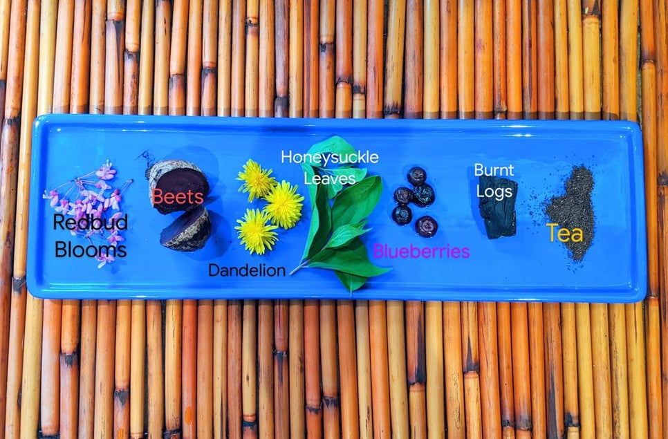
- Pigment materials- flower petals, leaves, tea, fruits & vegetables, spices & charcoal/soot
- White vinegar
- Salt
- Hot water
- Scissors
- Bowl
- Spoon
- Coffee Filter
- Containers for your ink
- Paper
- Paint brush
Step 1: Get Your Natural Materials Ready
In order to make the inks with your natural materials ready. You’ll need to cut them up or crush them. You can cut them with scissors and/or crush them with the back of a spoon. If you’re making more than one color ink make sure you wash your scissors or spoon in between so you don’t mix colors. Add each natural material to a separate container.


Step 2: Mix Your Natural Inks
You’ll need hot water, almost boiling, to add to your natural materials. Our natural materials measured to about 1 TBS each. We added in 1/4 cup of water- you can add more depending on how much natural materials you have. After you do that you need to add the vinegar (1/2 tsp per ¼ cup of water) & salt (1 pinch per container). Vinegar has been used in inks for quite a while. It’s what’s called a “mordant” or “fixative”. It helps the dye “bind”, “set”, or attach onto paper of fabric. The salt will help preserve the ink so that it lasts longer. Now let it sit overnight.
*Optional, come back in an hour to check on your ink. If it seems to light you can add more materials or other natural ingredients. Remember it”s not going to look like store-bought ink, it will be fainter in color. We added grass clippings to the green ink & raspberries in the pink ink. Look at our final ink picture to see what it will look like.


Step 3: Finish Your Natural Ink
When you come back you should see that the water is tinted the color of your natural materials. Now you need to sift out the particles so it’s all liquid. Use a coffee filter stretched over your final ink container to catch the solids.


Saturday, June 8, 2019
Only Slightly Exaggerated... - Travel Oregon
Scored by the Oregon Symphony, Only Slightly Exaggerated is a fantastical tourism commercial created for Travel Oregon by Portland-based advertising agency Wieden + Kennedy. The video celebrates the state’s magic and natural wonders, including its forests, coasts, colors, culture, and more. But please be aware, per Oregon Live‘s Lizzy Acker:
Animated by Psyop and Sun Creatures Studio, the commercial’s anime-style and imaginative exaggerations are also an ode to Hayao Miyazaki’s Studio Ghibli, creators of My Neighbor Totoro, Ponyo, Kiki’s Delivery Service, and other classic animated films.
For comparison, here are a couple of my photos from the Woodburn Tulip Festival in 2014.


